All posts by Michael Roberts

I make things easy to use.

WIP: Stormtrooper Atari 2600

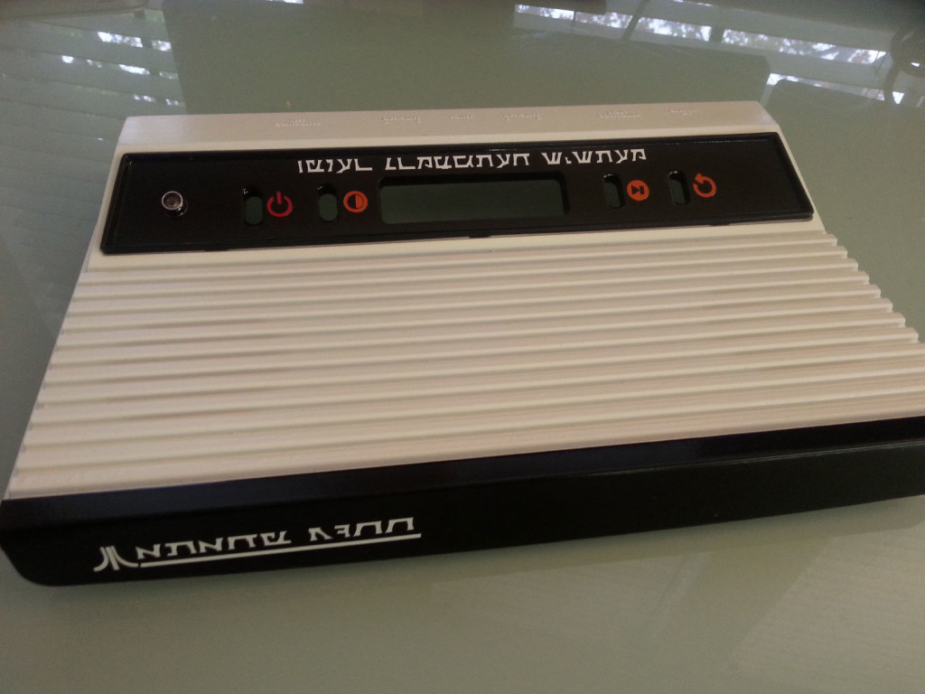
As a riff on the all-black “Vader” 2600s, I made a white/black “Stormtrooper” case.
uxfab_stormtrooper_2600

The text is die-cut using Erikstormtrooper’s “Sith Prophecy” font. It does read “Video Computer System” above the slot and “Atari 2600” on the front panel.

I know what you’re going to say – text on an a Stormtrooper’s Atari console would be in Aurebesh  – and that learning the ancient language of the Sith would probably mean certain death for a Stormtrooper. Let’s just say a whole bunch of the clumsy lugs chipped in and had a unit built especially for Lord Vader. Consider it the lost segment of the Star Wars Holiday Special.
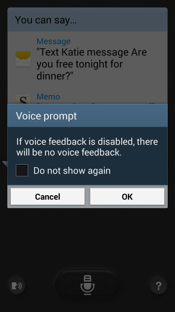
Microsoft Azure signup and Raising Arizona: life imitates art

please wait

young feller

Gale: “Alright all you hayseeds, it’s a stickup! Everybody freeze! Everybody down on the ground!”

Bank Teller: “Now, what’s it gonna be young feller? You want I should freeze or get down on the ground? ‘Cause if’n I freeze, I can’t rightly drop. And if’n I drop, I’m gonna be in motion.”

Now what’s it gonna be, Microsoft? You want I should wait or click there to refresh?

More industrial control panel goodness

kaizenelectricalsg045734

These low-volume industrial control panels are often a kick in the pants.

Note that:

  • R=Red, Y=Yellow, B=Blue. Unless the product emits/extrudes a substance in one of three primary colors (like a Play-Doh Barber Shop), I don’t think this is enough information.
  • “Star” and “Delta” aren’t very informative.
  • Alignment is consistently janky.
  • “Relay Rang” is either a typo or we simply ran out of space for characters.
  • Capitalization and punctuation of abbreviations are willy-nilly.
  • Something about it is potentially deadly.