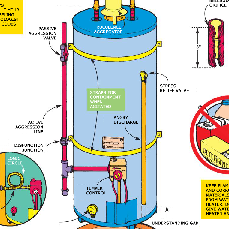
Do bad development tools contribute to bad software?


Above exchange is fictionalized, and the hypothetical UX designer was not operating at my best.

The tools that developers use are extremely complex. The domain certainly dictates their complexity – software development ain’t simple. To a non-developer, IDEs and issue trackers can appear cumbersome and confusing. Is this all by necessity?

Are development tools designed to the same set of expectations as the products they’re used to create, just for a very rich domain? Are they complex by (good) design? Or are they as opaque as they appear to a non-developer – complicated by (poor) design?

Does the required flexibility of development tools contribute to an over-flexibility of software, products that do too many things in too many different ways?

Or am I giving developers too little credit, and their expectations of product design aren’t shaped by the tools that they use at all?

Coincidence, great design, or both?

IMG_20170118_114229

Elementary school is now a grueling endeavor. In addition to water bottles, our children take one or two snacks to school every day. We must write each child’s name on his respective snacks to identify the snacks and keep them out of the apparently thriving granola bar/string cheese black market.

Granola bar packaging has a feature that is either a quirk or an example of brilliant design. Folding back the flap on the back of the wrapper reveals a strip of the package free of of any printing. It’s the perfect place to write the kid’s name with a Sharpie.

Is it a practical measure on the part of the producer to avoid printing any information on part of the packaging where it may be hidden? Is it intentionally left blank just to allow the user to write a name in felt marker?

In either case, it’s a darn handy affordance.

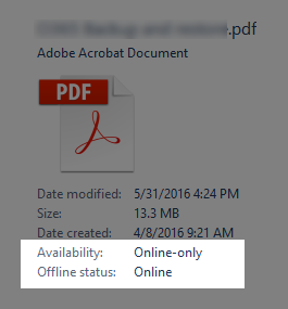
Did we mention it’s online?

acrobat

This appears to be two clumsy ways to convey the same information.  Apparently the document is “online”.

This does raise the question of what “online” actually means. The document is technically in a OneDrive library mapped to a network drive on my PC (not to be confused with a local copy that’s unreliably synced to the OneDrive library). Whew. Does “online” mean that it resides on OneDrive as opposed to my local machine? Since it’s accessed via a mapped network drive and not synced, does the online/offline distinction still apply?

The good news is that the “cloud space” still has plenty of maturing to do.

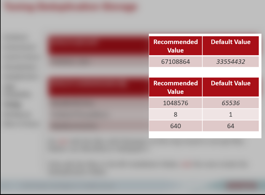
Forget the defaults, or “I said ‘67108864’, not ‘67108684’!”

defaults

Disclosure: This was cribbed from external marketing materials for a product and company with which I have no affiliation.

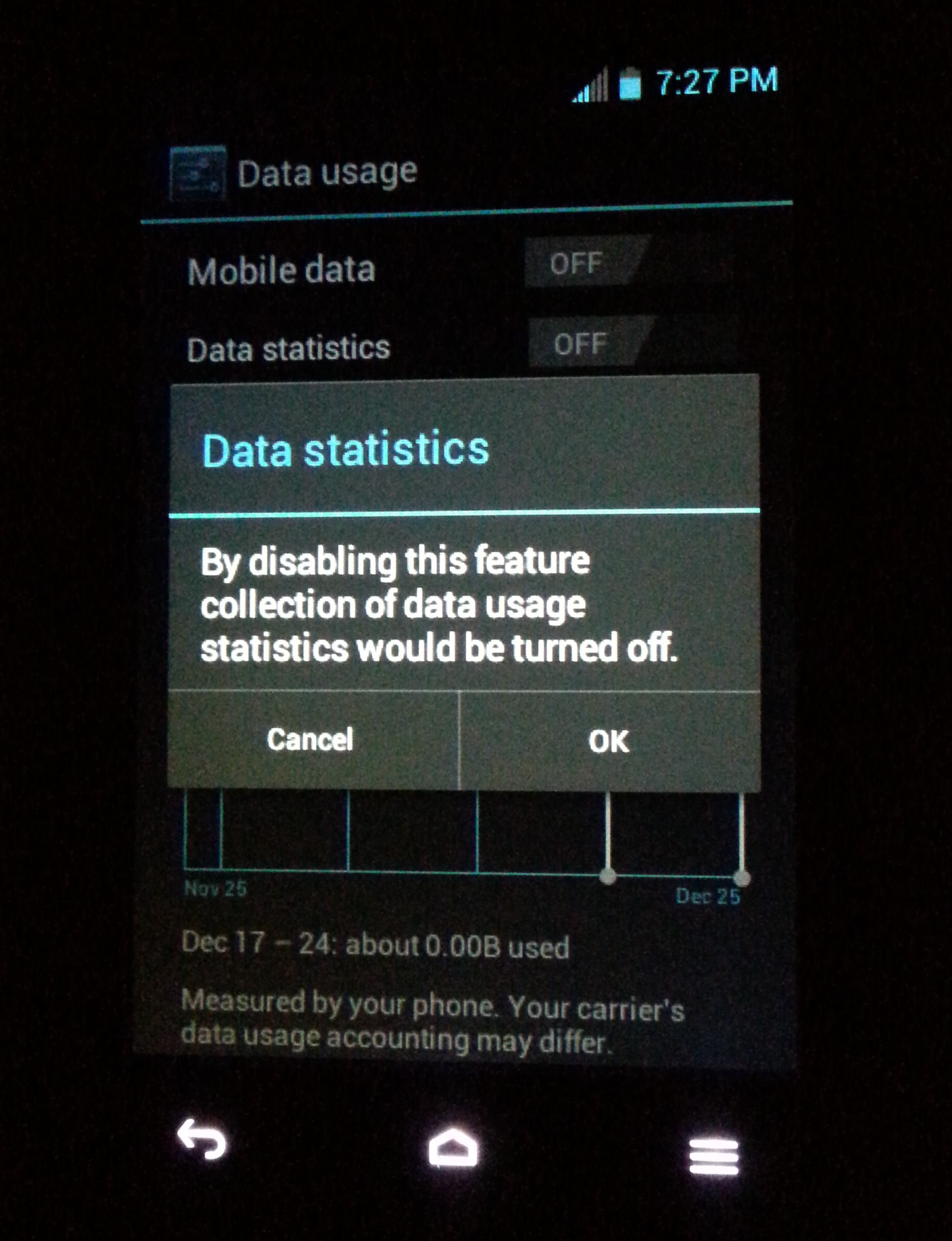
The obvious question: Aren’t default values the ideal way to express recommended values? What does it mean when the recommended value is so much greater than the default value?

Okay, so that was two questions.

As these numbers are incredibly specific, could data entry be simplified by offering fewer than a near-infinite number of choices?

How precise must data entry be? What’s the effect of entering 1048567 instead of 1048576?

Ceci n’est pas une terminal

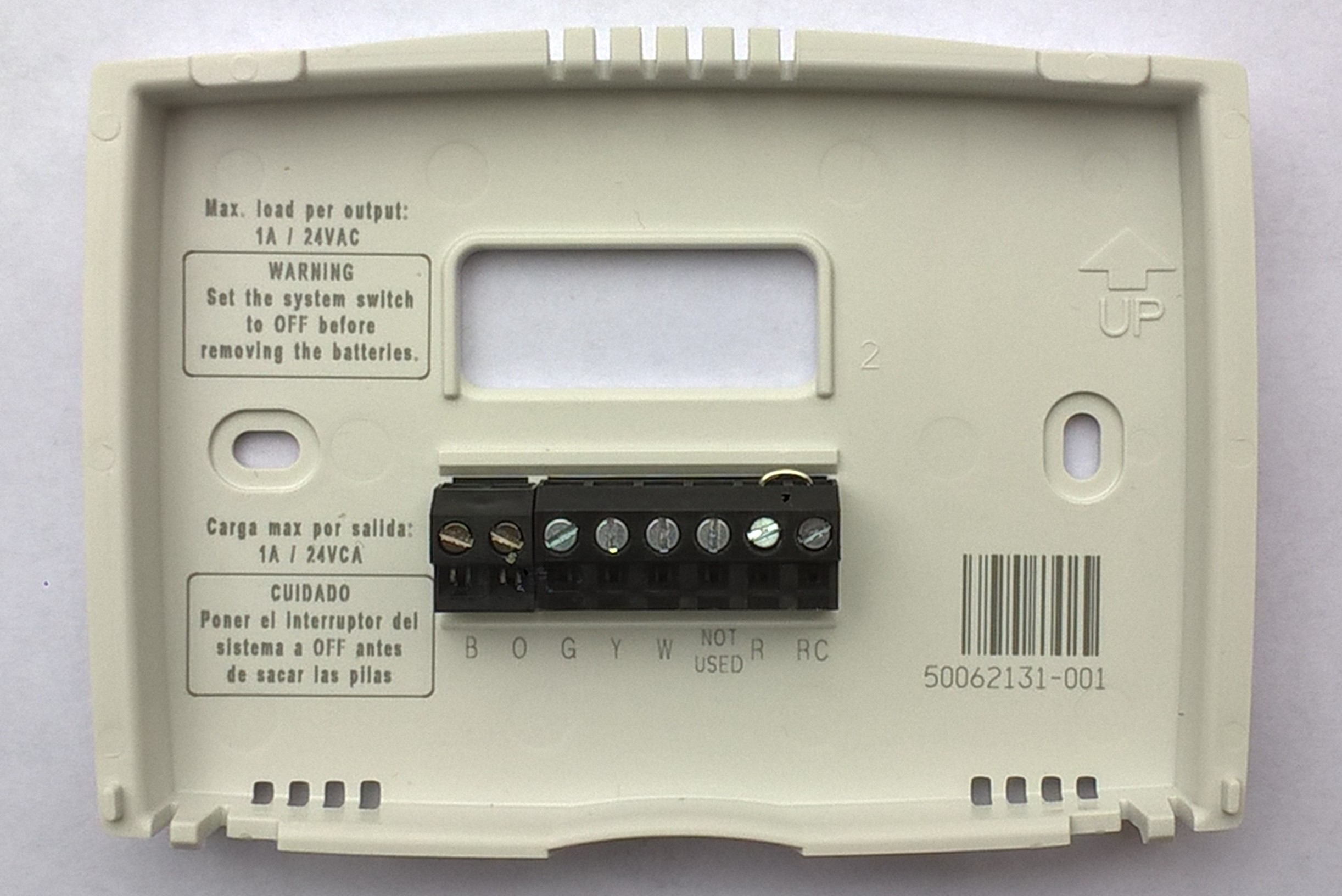
I hesitate to poke fun at this one, as the overall form factor of this $24 home thermostat is ingenious. The user levels and mounts the backing plate, inserts the wires and tightens the screws on the terminal block, and snaps the main unit onto the mounting plate. Pins on the back of the unit insert into the female side of the connector below the screw terminals. Everything aligns beautifully.

That said, I could not let a good “NOT USED” label go to waste. Obviously custom connectors are expensive compared to off the shelf items. I can cut them some slack for 24 bucks.

That warning about removing the batteries does come a bit late though…

WP_20160317_12_16_35_Pro

No great songs have been written about “balance”.

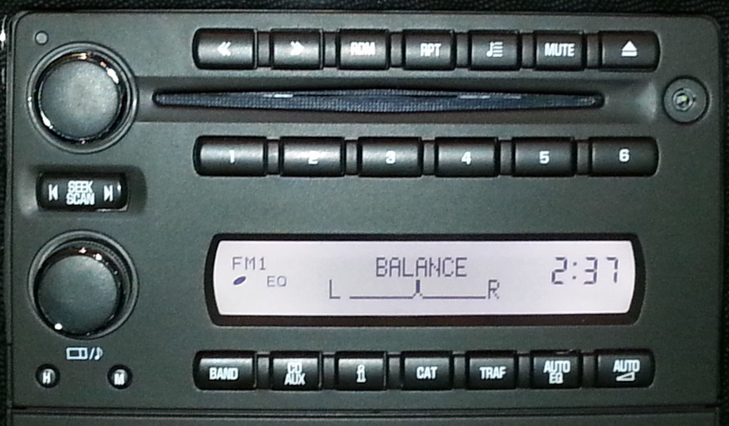
Picture this: you’re driving around on the perfect day and the perfect song comes on the radio. Let’s say it’s LL Cool J’s “Going Back to Cali” (just because). You hit the tone control knob on your factory stereo and you get…

uxfab_balance

Balance? No. Push the knob again: “Fader”. Again: “Treble”. Finally, “Bass”. You turn up the bass control a couple of notches but this span of inattention has caused you to miss the “I wanna do this Brutus, but I don’t wanna pay” line. To make things worse, you’ve run over a couple of people.

I don’t have any user data, but I would guess that the balance control is only used by people with hearing loss in one ear that they wish to damage further. For everyone else, the audio settings should be presented in the order of descending frequency of use. My first guess absent anything but first-person observation would be bass, treble, fader, and balance.

Proof positive: Internet is a series of tubes!

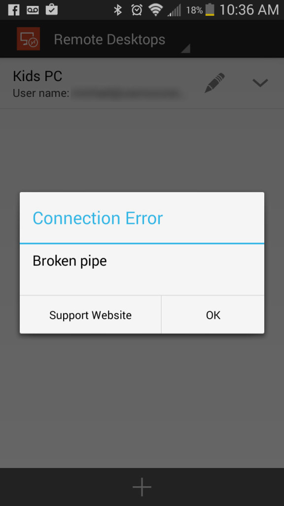
Microsoft’s new mobile Remote Desktop app is incredible. I can change the access control settings on the kids’ PC from downstairs while they sleep. It’s a very high-quality app, so this message came as a bit of a surprise:

uxfab_broken_pipe

At first glance it looks like a case of jargon, but it’s more likely this is “placeholder text” that wasn’t written by Tech Docs and was not caught by QA.

Milk crate PC “case”

Q: What do you call someone who spends more than $3.48 on a new PC case?

A: A perfectly normal, rational person.

uxfab_pccase
This is actually a staging rig for upgrades for the kids’ PC. I’m upgrading the motherboard, switching to an SSD, and switching from Windows 10 Pro 32 bit to 64 bit (I know), and this allows me to do so with minimal disruptions to their Minecraft machine. Also, orange milk crate!